3 New Ways to Use Colour in Interior & Architectural Design (Part 1)
- Jennifer Copley
- Sep 11, 2025
- 3 min read
Colour is one of the most powerful tools in architecture and interior design. It can change the way you feel and experience a space. Colour can alter your mood and create ambience. It can highlight or diminish architectural features, guiding the eye. As a tool to embody cultural meaning, identity, and taste, colour is the perfect tool for making spaces more expressive and personal.
At OVS, we look beyond the traditional feature colour wall and explore the latest colour trends that are bolder, richer, and more creative than ever.
Whether you’re planning a home renovation, refreshing your space, or designing a new build, here are 3 New Ways to Use Colour in Interior & Architectural Design.
Colour Drenching

Feeling brave? Take your chosen colour and apply it over every surface (including walls, fireplaces, ceilings, doors, skirting, and radiators) to achieve one of 2025’s key interior design trends – colour drenching.
Drenching a space in a single colour is an instant way to create harmony and cohesion. Applying one unified colour not only makes a bold statement, but it can also define the atmosphere of a room and the experience of space.
Rich jewel tones like forest green or deep blue can lend a stately quality to a room, in addition to making spaces feel more intimate. Pale pastels can soften and open a space, creating volumes that feel calm and airy. Architecturally colour drenching is a great option for rooms with complex angles or alcoves, uniting them into a cohesive visual story.
If you are looking for a technique that creates impact while minimising visual clutter, colour drenching could be for you.
Earthy Tones

Millennial grey is out -earthy tones are in! For 2025, the Pantone Colour Institute named Mocha Mousse (PANTONE 17-1230) its colour of the year. With connotations of chocolate and coffee, this muted brown hue signals richness and warmth.
As Pantone’s colour of the year suggests, neutral paint colours are evolving from cool hues to warm, earthy tones. Shades like clay, ochre, and sandstone bring a warm, grounded, natural feel to interiors while maintaining a timeless quality.
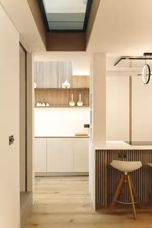
Earthy colours pair beautifully with natural materials. We love timber, rattan, bamboo and linen for example. They’re also versatile enough to work in both minimalist modern homes and traditional properties.
From an architectural perspective, earthy natural tones can be used to soften contemporary structures and add warmth to open-plan layouts.
Why not try exploring earthy tones when building a neutral palette? Layer with green foliage and natural textures for a contemporary biophilic aesthetic. Alternatively, apply earthy tones to accent a minimalist design scheme featuring natural materials and quality craftsmanship, in order to create a Japandi inspired design.
Mixing Metals

How can you get creative with colour without using paint? Look no further than metal finishes for creating reflective colour accents. The latest interior design trend is to mix different metal tones, such as brushed brass with matte black or polished chrome with antique copper, for a layered, curated look. Metallic accents can be the key to creating the feeling of contemporary luxury.
In the kitchen, explore pairing stainless steel appliances with brass tapware and black light fittings. The secret is to repeat each metal at least twice in the space; in this way, it will feel curated and considered, as opposed to accidental or unconsidered.
Architecturally mixing metals can be a great way to bridge different styles, unifying industrial, contemporary, and classic elements seamlessly within one space.
In Conclusion
The beauty of these 3 colour trends is that they’re adaptable. You can experiment with one technique for a subtle change or combine several for a rich, layered effect.
When working with an architect or interior designer, colour selection should be part of the overall design strategy, ensuring it enhances the space, complements the materials, and supports the intended atmosphere.
At OVS, we see colour as more than decoration; it’s an integral part of the design narrative. Whether you’re embracing earthy paint colours, experimenting with colour drenching, or mixing metals, we can help you use colour to create spaces that are both beautiful and functional.
Ready to explore creative uses of colour in your home or business? Contact us today to discuss how our team can bring your vision to life.


Comments